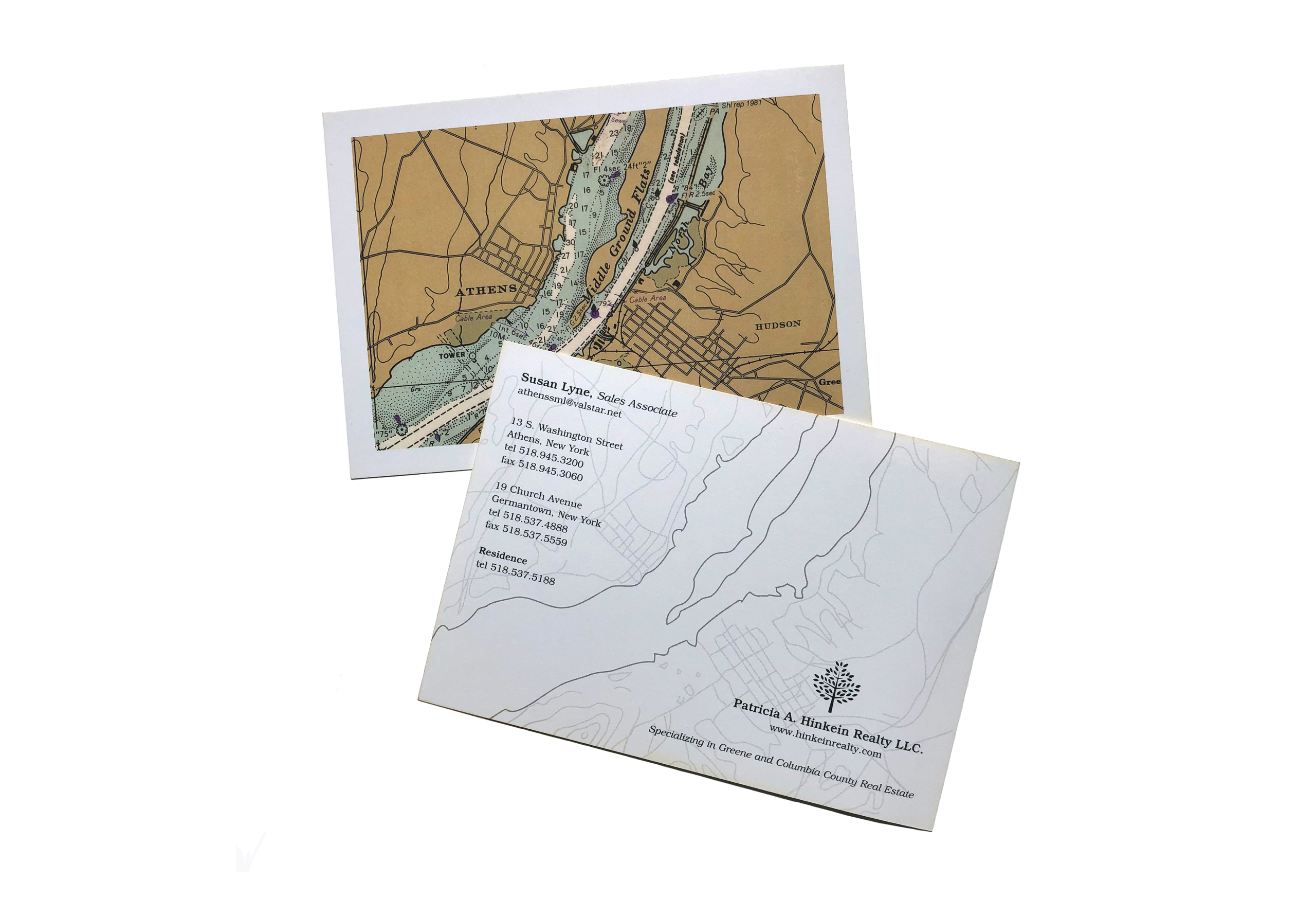
The client needed a business card introducing herself to the giant, local real estate community, so we went big. Postcard big. But how to fill so much space? I used a portion of a vintage county map with the mighty Hudson flowing through it for the front side and its “bones” on the text side to create visual interest in an otherwise barren landscape.
